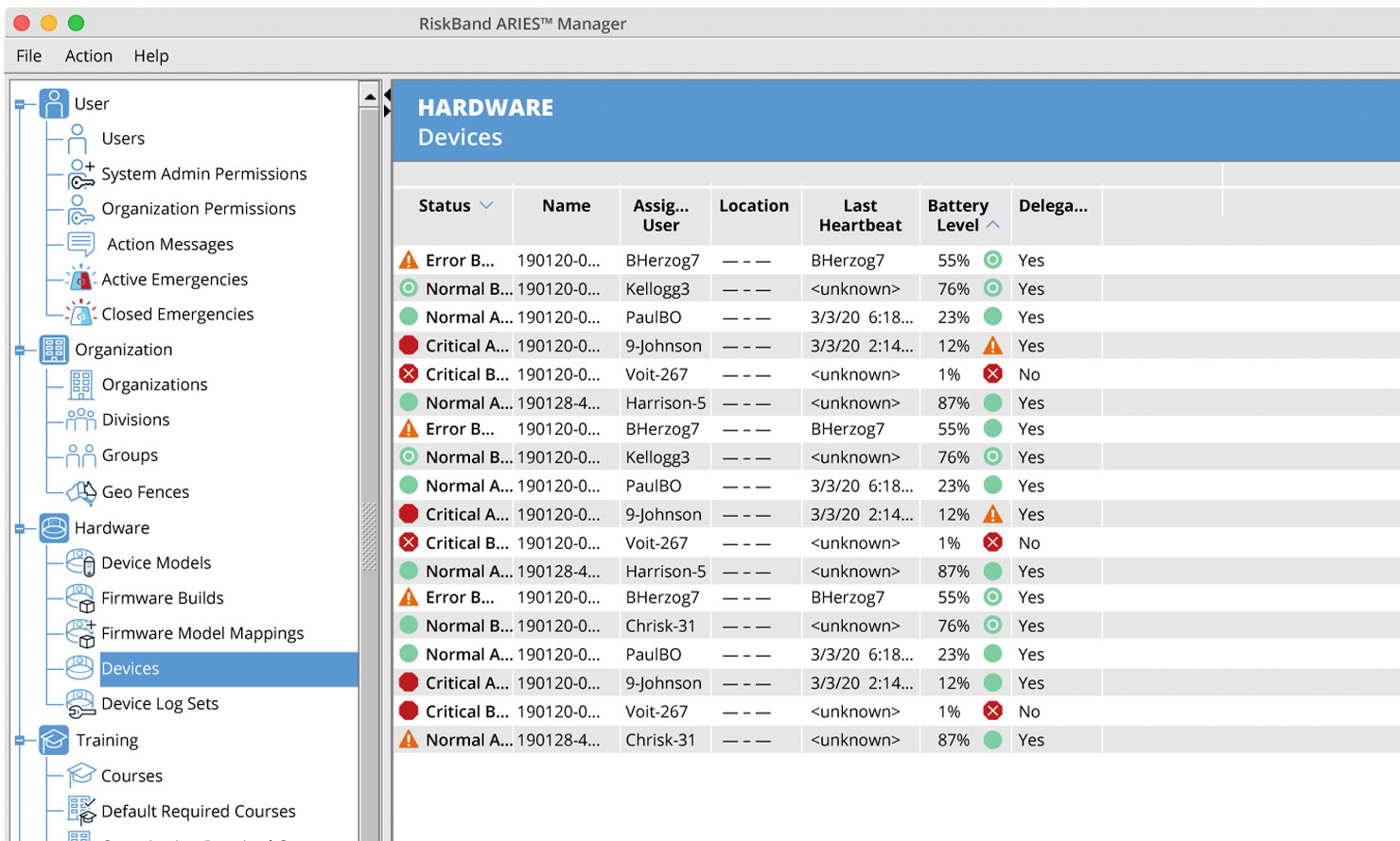
RiskBand Aries manager
This software monitors a companies set of RiskBand devices. It can properly assign the device to an individual. It can also set that users permissions. This interface was designed to match the brand standards that started with the company logo (designed by another source).
S
ize is always the first challenge when creating standard software interface icons. Often assigned a 16x16 at 72ppi space, and with software engineers who want to make that small space communicate multiple ideas — size is a challenge.
I have learned to build the sharpest icon by aligning my icon renderings to a pixel grid even before the image is pixelized. This helps me control the pixel hinting — creating a crisp-edge icon that is easy to read, even if I'm asked to add sub-icons to the image.
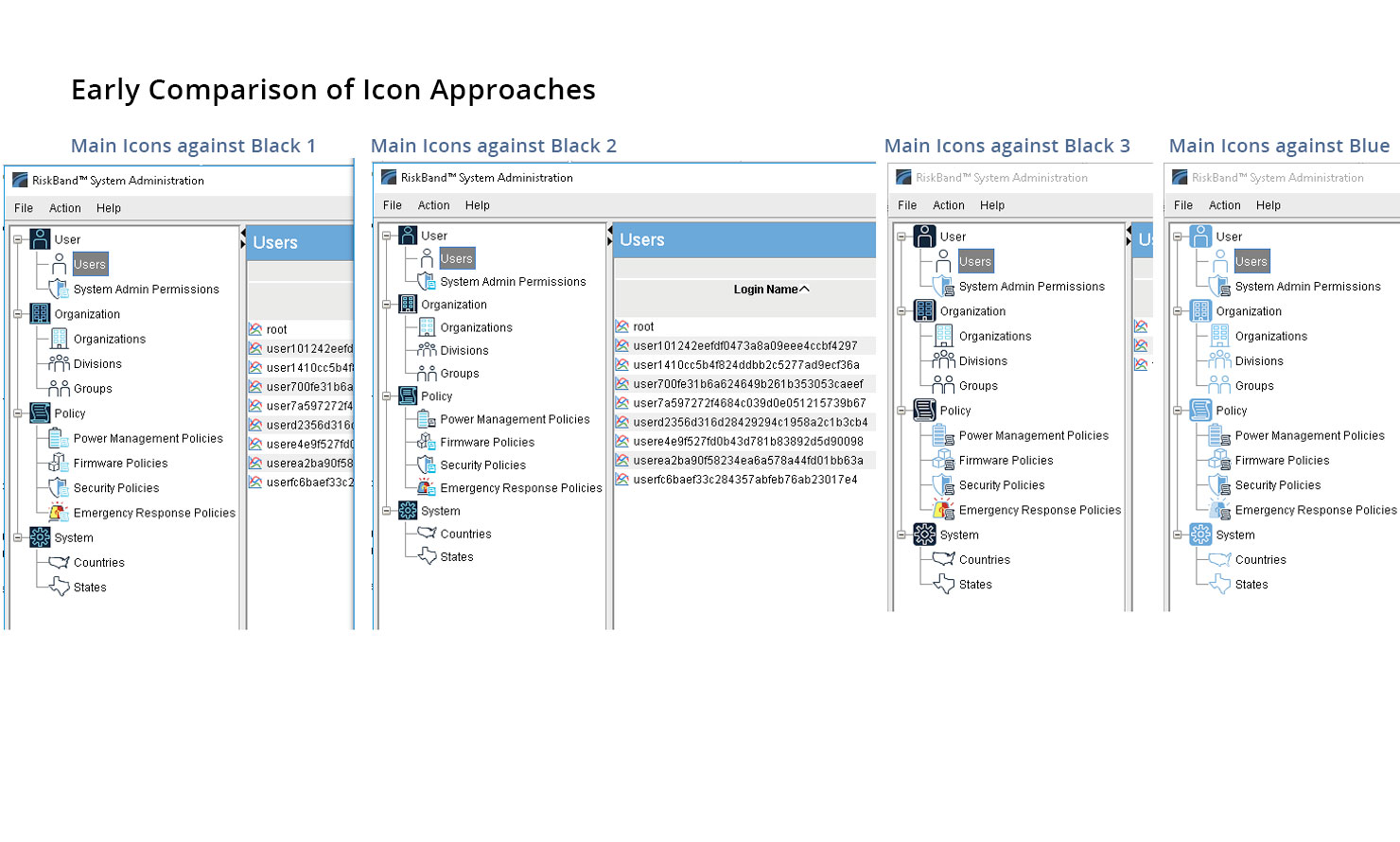
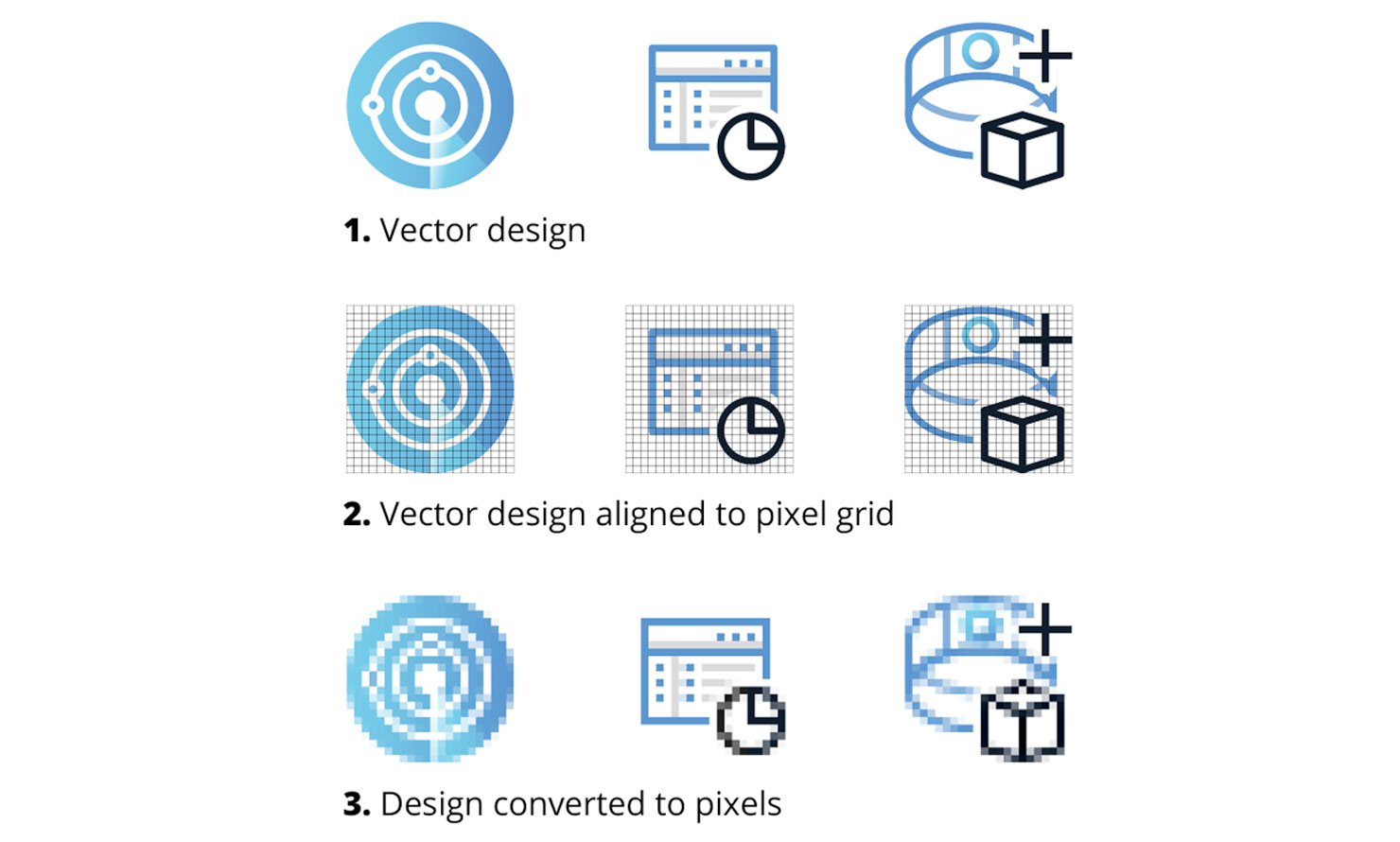 The process for icon development — RiskBand Aries device interface.
 RiskBand Aries device interface.
 RiskBand Aries device interface.
Discipline:UX / UI
Client:RiskBand / Whereable Technologies
Year: 2017–2020
Formula
1. Color System The design team that created the logo also supplied a useful color system. However they proposed placing light color icons against a dark background. When applying that system we recognized early that the contrast was too low for a quality interface.
2. Size Once color was determined, the next step was to work with the software engineers to determine the amount of space they were allowing to assign to the screen icons. Often this is done at default 16x16pixel sizes. In this case we were able to set the size of navigation icons at 22x22 pixels.
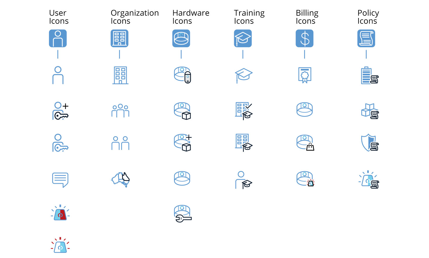
3. Unity After the colors and sizes are determined, the next challenge is maintaining a consistency to the full icon set. I seek to apply harmony to the entire set. This is done by using similar shapes, curves, etc.
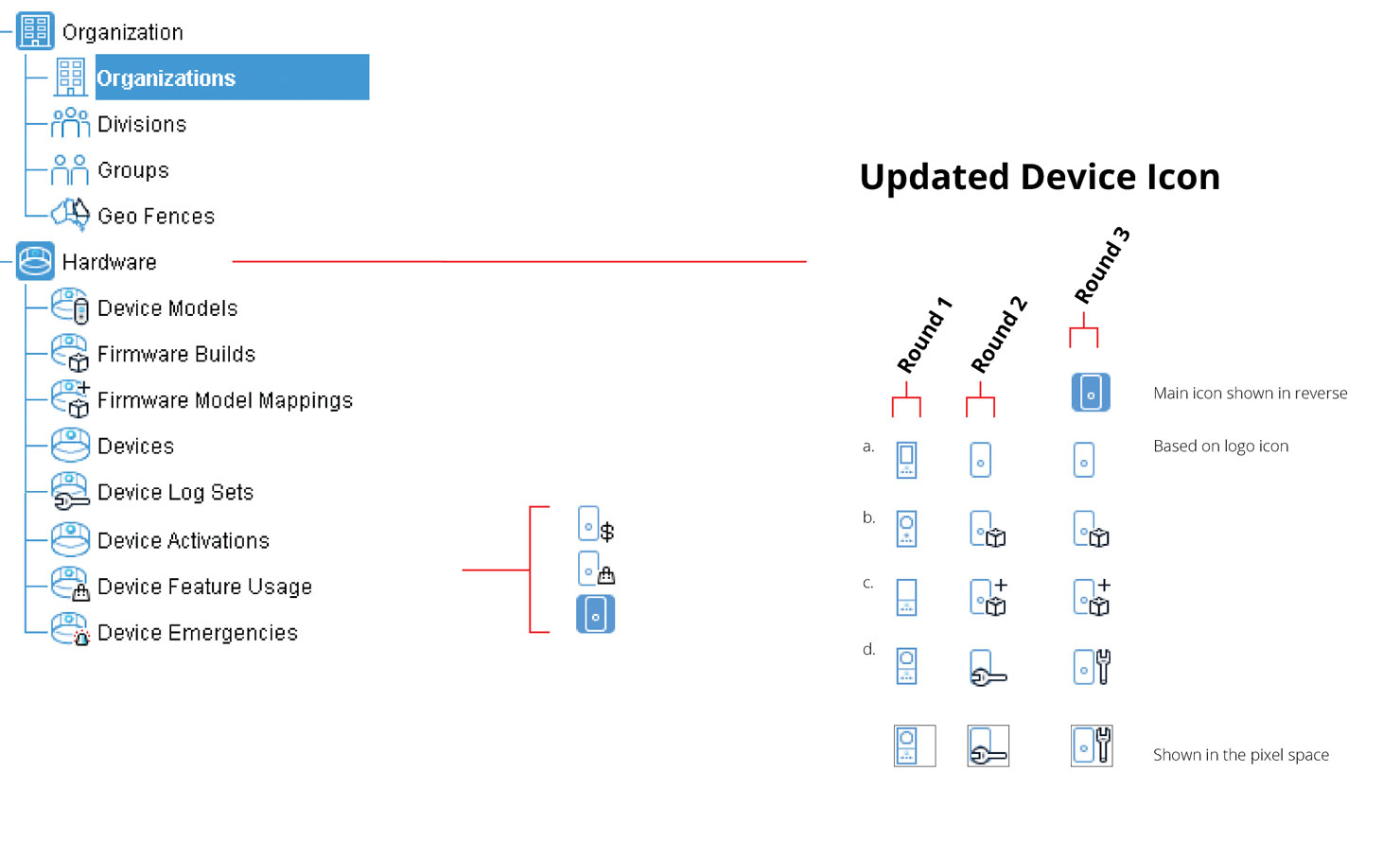
4. Sub-Icons Initially we design the key icons, eventually most of those will be devided up into icons with states. For example a user icon, the states being administrator, standard user, delegated user, etc.
 RiskBand Aries device screen progression.
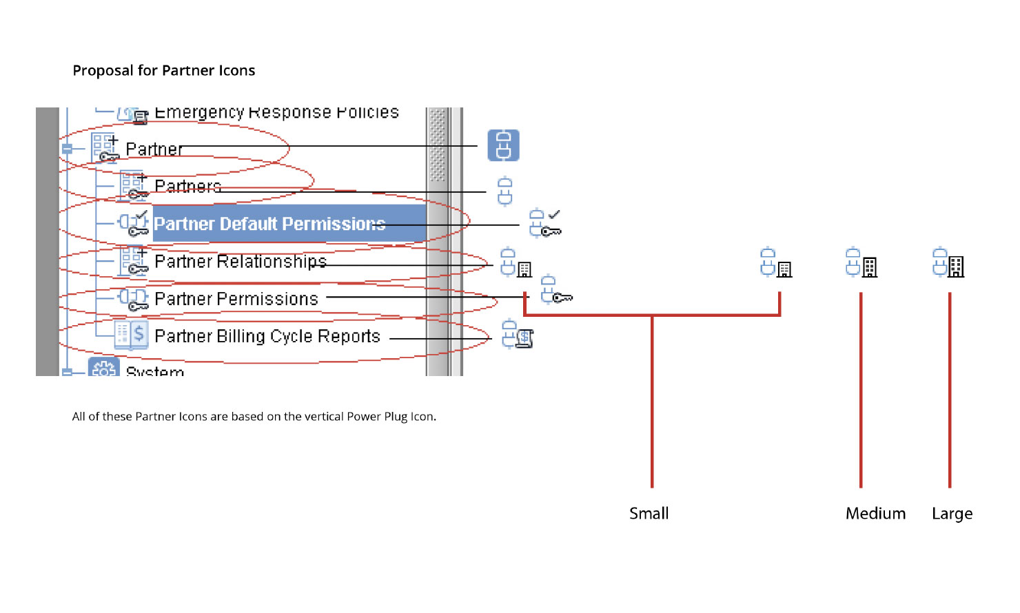
Adaptation
The original vision for the icons did change based on the realities of the hardward. That is, as it was too difficult to fit all the product into a watch-size element, the icons had to change to reflect the smartphone-size product that was eventaully produced.
 RiskBand Aries device interface prototype development.
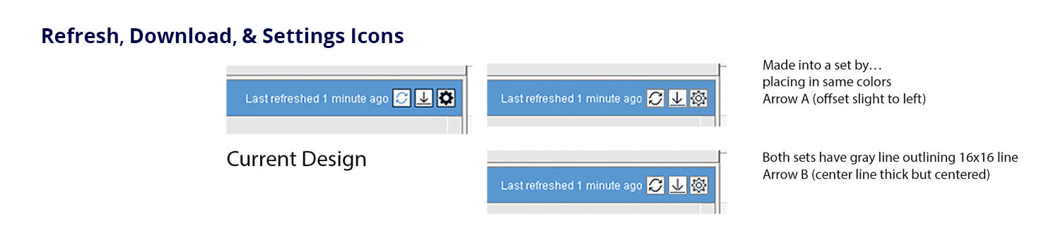
The software programmer would often send a screenshot marked with circles showing which icons are to be changed with notes making suggestions for the updates. I would often use those same screens to send the proposals for the new icons.
 RiskBand Aries device interface.